On this page
This page collects the visual foundations of git.nrw for slides, videos, thumbnails, and print material. It is aimed at everyone creating material about git.nrw – at universities, in the community, or in the project team. It is based on the website’s design system: professional, institutional, and accessible.
Logo
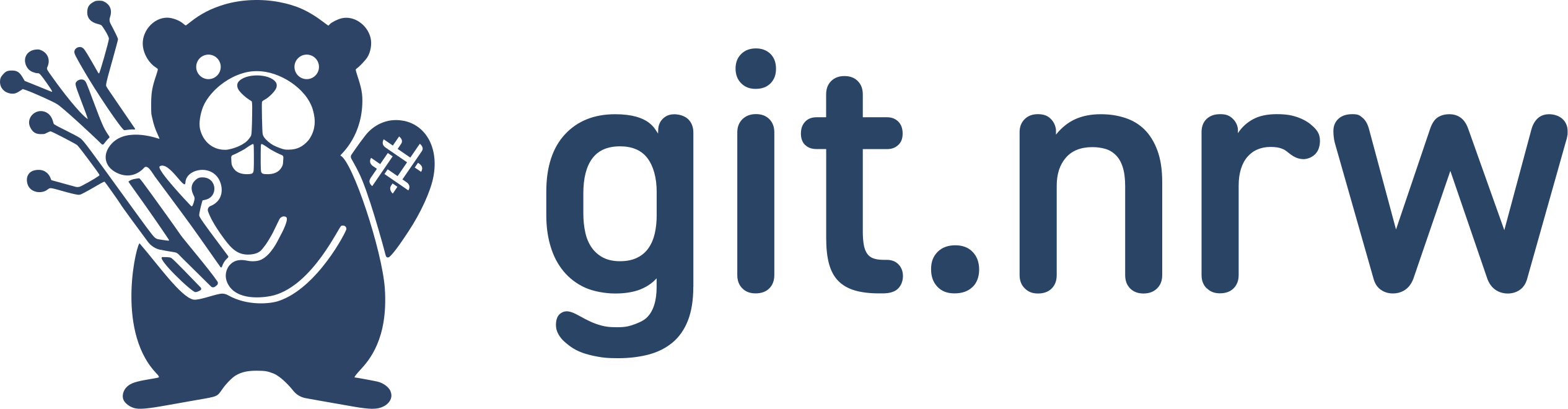
The git.nrw logo is available as SVG, which makes it suitable for slides, documents, video exports, and the web alike.
Please note:
- Keep the original proportions and leave sufficient clear space – do not crowd the logo with text or other logos.
- Prefer white or very light backgrounds; on primary blue, place the logo in a light panel.
- Do not recolor, distort, rotate, crop, or apply effects to the logo.
Avatar and favicon
An avatar and the favicon are available for square placements. Do not use avatar graphics as decorative background patterns.

Avatar
Square placements: profile images, platform avatars, channel icons
PNG · 1000 × 1000
Favicon
Browser tabs and app icon contexts
SVG
Colors
The palette matches the website’s color tokens
(defined in assets/css/base/colors.css).
Core colors
--primary
#003057
RGB 0, 48, 87
Brand color for title slides, headers, and large backgrounds
--accent
#f6a800
RGB 246, 168, 0
Sparingly for highlights, rules, and calls to action
--secondary
#b6c0cc
RGB 182, 192, 204
Borders, dividers, and subdued surfaces
--text
#04060b
RGB 4, 6, 11
Body text on light backgrounds
--background
#ffffff
RGB 255, 255, 255
Default light background
Supporting shades
Primary 50
#e5eaee
--primary-50
Primary 400
#335978
--primary-400
Primary 950
#00182b
--primary-950
Accent 50
#fff7e5
--accent-50
Accent 700
#996900
--accent-700
Background 50
#f7f7f7
--background-50
- Build on white or primary blue, with accent yellow for emphasis.
- Use yellow sparingly – for rules, markers, and single terms, not for large blocks of text.
- Dark text on light backgrounds or very light text on primary blue; keep contrast strong.
- Do not introduce additional dominant color schemes unless the material clearly belongs to a partner institution or event series.
Typography
The website uses two self-hosted variable fonts: Inter for headings and Noto Sans for body text. Both are freely available (SIL Open Font License) and can be installed locally for slides and videos.
Inter
git.nrw
Version control for universities in NRW
AaBbCcDdEeFfGgHhIi 0123456789
- ExtraBold 800 · Bold 700 · SemiBold 600
Noto Sans
The platform brings together courses, documentation, and community resources around Git and GitLab for universities in North Rhine-Westphalia.
AaBbCcDdEeFfGgHhIi 0123456789
- Regular 400 · SemiBold 600 · Bold 700
- Use large, short titles instead of dense text slides; keep lines short on title cards.
- Use sentence case for readable educational material.
- Avoid decorative fonts – they weaken the institutional tone.
Media and templates
For slides, videos, and thumbnails: 16:9 format, generous margins, one clear focal point, high contrast. Thumbnails work best with a primary-blue background, a very large Inter title (one to three words per line), and a single yellow icon or marker.
Thumbnail generator
Creates course and video thumbnails in the git.nrw design directly in the browser – no graphics software needed.
The repository also contains the editable sources:
assets/img/thumbnail-template.svg– thumbnail template (SVG)assets/img/thumbnail-template.afdesign– editable source filestatic/images/og-default.svg– default social media preview image
Partner and funding logos
Logos of universities, DH.NRW, and the MKW NRW are stored in the repository
under static/images/icons/logos/, but they are not freely reusable: they
are licensed for this project only (see the LICENSE file in the same
directory). For your own material, obtain permission from the respective
institution.
When partner or funding logos are used:
- Keep logos in their original colors and align them on a shared baseline.
- Give partner logos more whitespace than regular UI icons.
- Do not create new logo combinations that have not been agreed upon.
Questions about the brand?
If you are unsure how to use the logo, colors, or templates, we are happy to help.